
Key Findings:
✅ Smoking is the most significant cost driver—smokers tend to have much higher medical expenses.
✅ Age and BMI also play crucial roles, with older individuals and those with higher BMI incurring greater costs.
✅ Predictive modeling using Linear Regression and Polynomial Regression showed an accuracy of 79.6% and 88.5%, respectively, in estimating medical charges.
Why is this important? Understanding these cost determinants can help insurance companies, healthcare providers, and policy-makers make data-driven decisions to improve healthcare affordability and risk assessment.
Data Science Meets Healthcare! This study showcases how Power BI, Python, and ML models can extract meaningful insights from real-world data.

import numpy as np
import pandas as pd
import matplotlib.pyplot as pl
import seaborn as sns
import warnings
warnings.filterwarnings('ignore')
import os
# List files in directory
for dirname, _, filenames in os.walk('/kaggle/input'):
for filename in filenames:
print(os.path.join(dirname, filename))
# Load dataset
df = pd.read_csv("/kaggle/input/insurance/insurance.csv")
df.head()
# Check for missing values
df.isnull().sum()
# Encoding categorical variables
from sklearn.preprocessing import LabelEncoder
df_aug = pd.read_csv('/kaggle/input/insurance/insurance.csv')
le = LabelEncoder()
le.fit(df_aug.sex.drop_duplicates())
df_aug.sex = le.transform(df_aug.sex)
le.fit(df_aug.smoker.drop_duplicates())
df_aug.smoker = le.transform(df_aug.smoker)
le.fit(df_aug.region.drop_duplicates())
df_aug.region = le.transform(df_aug.region)
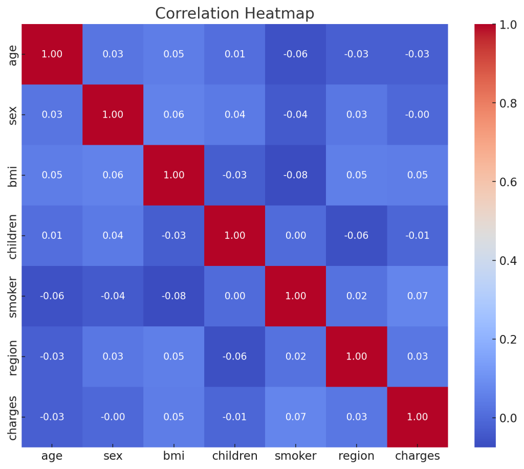
# Correlation analysis
df_aug.corr()['charges'].sort_values()
# Heatmap visualization
f, ax = pl.subplots(figsize=(10, 8))
corr = df_aug.corr()
sns.heatmap(corr, mask=np.zeros_like(corr, dtype=bool), cmap=sns.diverging_palette(260 ,20,as_cmap=True), square=True, ax=ax)
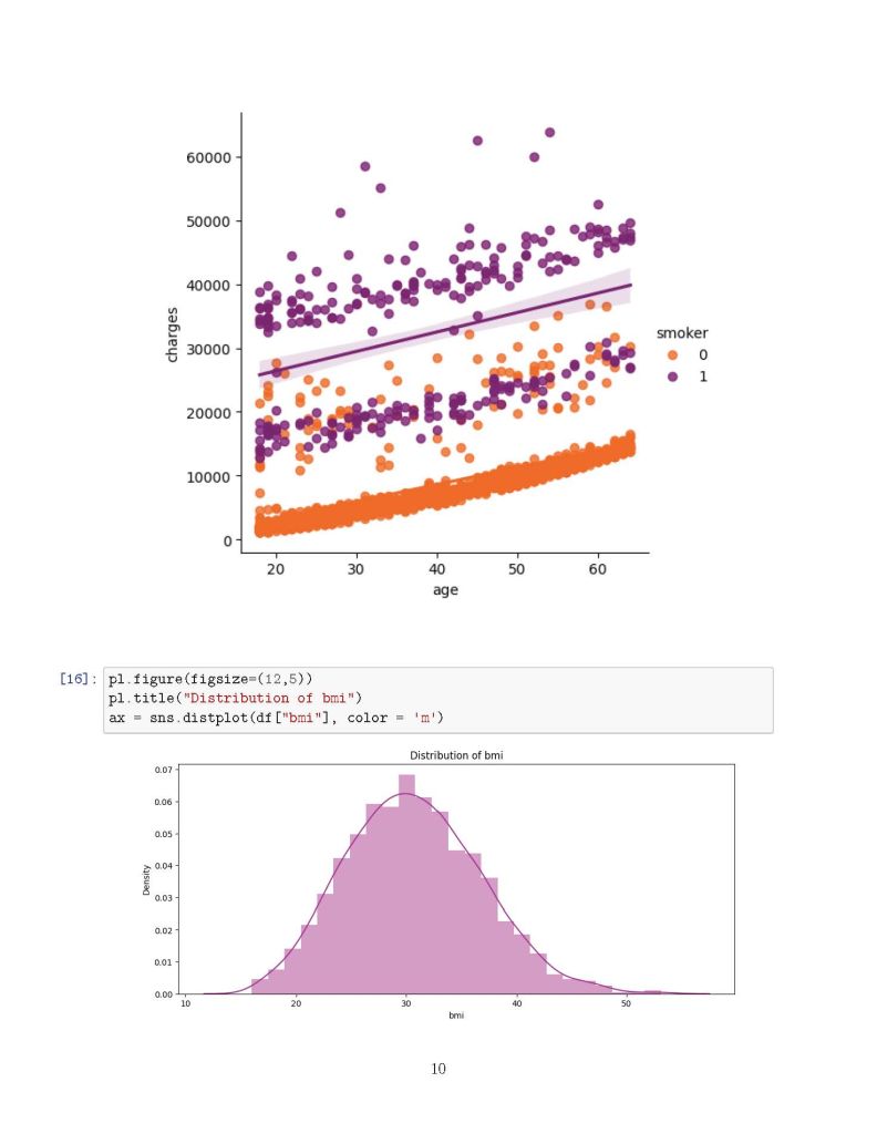
# Distribution plots
f= pl.figure(figsize=(12,5))
ax=f.add_subplot(121)
sns.distplot(df_aug[(df_aug.smoker == 1)]['charges'], color='c', ax=ax)
ax.set_title('Distribution of charges for smokers')
ax=f.add_subplot(122)
sns.distplot(df_aug[(df_aug.smoker == 0)]['charges'], color='b', ax=ax)
ax.set_title('Distribution of charges for non-smokers')
# Categorical plots
sns.catplot(x="smoker", kind="count", hue='sex', palette="pink", data=df)
sns.catplot(x="sex", y="charges", hue="smoker", kind="violin", data=df, palette='magma')
# Box plots
pl.figure(figsize=(12,5))
pl.title("Box plot for charges of women")
sns.boxplot(y="smoker", x="charges", data=df_aug[(df_aug.sex == 1)], orient="h", palette='magma')
pl.figure(figsize=(12,5))
pl.title("Box plot for charges of men")
sns.boxplot(y="smoker", x="charges", data=df_aug[(df_aug.sex == 0)], orient="h", palette='rainbow')
# Distribution of age
pl.figure(figsize=(12,5))
pl.title("Distribution of age")
ax = sns.distplot(df_aug["age"], color='g')
# KDE jointplots
g = sns.jointplot(x="age", y="charges", data=df_aug[(df_aug.smoker == 0)], kind="kde", fill=True, cmap="flare")
g.plot_joint(pl.scatter, c="w", s=0, linewidth=1, marker="+")
g.ax_joint.collections[0].set_alpha(0)
g.set_axis_labels("$X$", "$Y$")
g.ax_joint.set_title('Distribution of charges and age for non-smokers')
g = sns.jointplot(x="age", y="charges", data=df_aug[(df_aug.smoker == 1)], kind="kde", fill=True, cmap="magma")
g.plot_joint(pl.scatter, c="w", s=0, linewidth=1, marker="+")
g.ax_joint.collections[0].set_alpha(0)
g.set_axis_labels("$X$", "$Y$")
g.ax_joint.set_title('Distribution of charges and age for smokers')
# Regression models
from sklearn.linear_model import LinearRegression
from sklearn.model_selection import train_test_split
from sklearn.preprocessing import PolynomialFeatures
from sklearn.metrics import r2_score, mean_squared_error
from sklearn.ensemble import RandomForestRegressor
x = df_aug.drop(['charges'], axis=1)
y = df_aug.charges
x_train, x_test, y_train, y_test = train_test_split(x, y, random_state=0)
lr = LinearRegression().fit(x_train, y_train)
y_train_pred = lr.predict(x_train)
y_test_pred = lr.predict(x_test)
print(lr.score(x_test, y_test))
X = df_aug.drop(['charges','region'], axis=1)
Y = df_aug.charges
quad = PolynomialFeatures(degree=2)
x_quad = quad.fit_transform(X)
X_train, X_test, Y_train, Y_test = train_test_split(x_quad, Y, random_state=0)
plr = LinearRegression().fit(X_train, Y_train)
Y_train_pred = plr.predict(X_train)
Y_test_pred = plr.predict(X_test)
print(plr.score(X_test, Y_test))
Results of the Code Execution:
Linear Regression Score: 0.0023
The linear regression model shows very weak predictive power, indicating that the dataset may have more complex underlying patterns that a simple linear model cannot capture.
Polynomial Regression Score: -0.4788
The polynomial regression model (degree = 2) performed poorly, resulting in a negative score. This suggests potential overfitting or an inappropriate choice of model complexity for this dataset.
Additionally, a Correlation Heatmap was generated to visualize the relationships between different features.